Description:
This widget displays a large text area control on the Form.
Inputs
- ID/Name - Name of widget generated by FlowWright (read-only field)
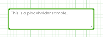
- Placeholder - Enter text to display on the render
- Default Value - Enter a default value
- Enable Voice Input - Select the checkbox to enable voice input
- Required - Select the checkbox for mandatory (tick mark)
- Hide - Select the checkbox to Hide (tick mark)
- Read Only - Select the checkbox to Read-Only (tick mark)
- Tool Tip - Enter information to display on mouse hover on form render
- Globalize - When applicable
- Translate - Click to translate the text
- Save Translation - Click to save the translated text
- Styles - Enter the CSS scripts for widget styles
- Apply Classes - Select between custom classes defined
- Maximum Allowed Characters - Enter value to accept maximum allowed chars (in v9.12)
- Maximum Allowed Words - Enter value to accept maximum allowed words (in v9.12)
- Save - Save the input values
- Delete - Remove this form widget from the designer page
- Close - Close the input popup window
Design:
Example:
Let’s build and execute the “TextAreaWidgetDef” example.
- Create a Form Definition called “TextAreaWidgetDef.”
- Drag a “BootstrapGrid, Label, Text Area, Submit” control onto the canvas and arrange them as shown below.

- Double-click the “Text Area” widget to configure its “Settings” properties. Provide a name for the control and placeholder text. Set the default text value. Select the checkbox to "Enable voice input". Check the “Required” box for mandatory input. Check the box to hide the control and make it read-only at runtime. Set the maximum number of characters or words. Click the Save button.

- Double-click the “Text Area” widget to configure the “Styling” properties. Enter the CSS syntax. Select the classes to apply from the global drop-down list. Click the Save button.

- Double-click the “Text Area” widget to configure the “Other” properties, then enter the tooltip text and click the Save button.

- Double-click the “Text Area” widget to configure the “Globalize” properties. The application will notify you if there is nothing to globalize. Otherwise, select the language from the drop-down list, then click the “Translate” button. You can overwrite the translated text with something more suitable for your style. Click the “Save Translation” button.

- Save the Form definition. Choose Actions > Create Form Instance from the menu. Generate a new Form Instance, then check the box to edit this Form Instance.

- The form is displayed to the user. Enter the user input. Click the “microphone” icon to use the microphone. Click the “clear” icon to remove the text. Text exceeding 25 words is not accepted due to configuration limits. Click the “Submit” button to finish.

- Select the culture flag to view the control in a globalized format.

Definition Sample:
You may download and extract the sample definition(s) from the link provided and later import them (drag-and-drop) into your FlowWright Process Definition (XML file) or Form Definition (HTML file) page.
Note: Please verify and complete the process steps for any missing configurations, such as file path references and database connections, after the import. Then, save the definition to confirm the changes.
Click here to download the sample file.